Archives
-
Paint Shop Pro X : Solution for Weird Screenshot Colors
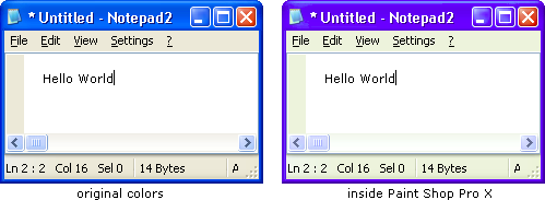
I’ve been using various versions of Paint Shop Pro for a couple of years now; virtually every bitmap I need when developing software (either for the GUI or the documentation) has at some point been touched by this program. I just bought version 10 (upgrading from version 9) and encountered a problem that was pretty confusing at first: A simple screenshot (taken using [Ctrl-]PrtScr), appeared with distorted colors when being pasted into Paint Shop Pro X.

It took me some time to figure this out, so just in case somebody else has the same problem: In version 10, Paint Shop Pro has a new “color management” feature that is enabled by default. If you don’t need that feature and just want to work like you have done with earlier versions, the simplest solution is to switch it off via “File” -> “Color Management” -> “Color Management” dialog -> Uncheck “Enable Color Management”.
I’m sure that the color management is a really useful feature (for those who need it), but the “out-of-the-box experience” for somebody like me (whose first thought after setup wasn’t exactly “gee, I really need to calibrate my monitor now”) has been a bit confusing.
P.S. Just out of curiosity, I calibrated my monitor (“File” -> “Color Management” -> “Monitor Calibration”). Needless to say, even without spending much time, things look much better (but I’ll keep color management off anyway ;-).
-
PDC 05: WPF (aka "Avalon") - Wow, I am impressed...
Data binding everywhere (every control, every property bindable), data templates (that can also be changed on the fly, depending on e.g. the value of a certain property) – I just saw virtually all my GUI problems of the last years solved. Okay, there will be new problems, but this is such a huge step forward… impressive.
-
PDC 05: See GhostDoc at the "Show Off" Session
-
PDC 05: Monospaced fonts everywhere :-(
In the sessions I’ve been so far, each time code is shown on the screen, it’s in some monospaced font. Either “Lucida Console” (which is kind of ok), or worse “Courier New” (by the way: am I really the only person on the planet to notice that this font doesn’t scale well? It sucks on high-resolution laser printers, and it’s not that great on-screen in sizes larger than say 12pt).
Anyway, if we’d still be programming with C-style function names, I wouldn’t complain. But now that Microsoft advocates long identifier names for years, and the Framework libraries making heavy use of long and descriptive names (and I’m all for that!), why is it that everybody still thinks that code needs to be in monospaced font, even if it means that some identifier names span several meters on the projection screens?
-
Microsoft Campus Tour
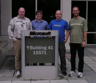
Today was the day: the day of the Microsoft Campus tour which was a prize for winning Roy Osherove’s Visual Studio add-in last year (read here).
from left to right: my colleague Jochen Manns, Keen Brown (MS),
me, my other colleague Sascha LehmannI’d like to thank Keen (who filled in for Josh) and Sara – it was a fun day!
The things that amazed me the most: the size of the campus and the speed at which Sara talks ;-)
-
GhostDoc - The Movie ;-)
I just submitted my video for the PDC 05 “Show Off” session. Producing this video was much more work than I expected, which means that I won’t be able to release the final of 1.3.0 before the PDC (I’m already leaving on Thursday, as I’ll take a little detour on my way to L.A).
The hardest part of the video was speaking English and presenting GhostDoc – either I mis-pronounced a word or stumbled over a wicked combination of “s” and “th” (which I wouldn’t care about in a real-life situation), or I made a mistake during the presentation. Fortunately with some editing, many things can be fixed.
If the video is accepted, it will be shown at the “Show off” session and will be made available after the PDC. Sorry, I can’t post a download link before the PDC.Update: The video was accepted and shown at the PDC, and is now up on Channel 9.
