Archives
-
Just for Fun: Simple Control for Terminal-style Output
The other day I was playing around with the RichTextBox, learning how to use this control. One of my experiments produced the effect of text being displayed on an old terminal, character by character.

Now I've wrapped this code in a simple control. Please don't ask me what it can be used for. Maybe for an "About..." dialog. I don't even know what I will do with it. It's just that from time to time I have to write some useless fun stuff to relax a little ;-).
You can download the code (VS.Net 2003) here; an example project is included so it's just "unzip, open solution, hit F5".
The
Write()andWriteLine()methods are used for adding text to the output,ClearScreen()empties the output area. The control can be customized using the propertiesBackColor,ForeColor,FontandCharactersPerSecond. -
Visual Inheritance - How to escape Layout Hell
Visual inheritance (VI) is a very powerful feature; unfortunately, some of the more tricky bits are not that well-documented. A lot of things can go terribly wrong (like controls moving themselves to unexpected locations), as I had to learn the hard way in the last weeks. But if you follow a few simple rules, VI does work reliably.
First a short introduction for those who haven't looked into VI yet (actually, it took me some time to really discover VI). In C# (and other .NET languages) forms and controls are no longer "magic" things (like e.g. in VB6) but simply classes derived from special base classes (e.g. System.Windows.Forms.Form). Such a class can in turn be used as the base class for another class; if a base form contains controls, the derived form inherits them. Again, there's nothing magical to this all; when looking at the code (or better: single stepping through it), it's pretty obvious how VI works. The constructor of each form/control class contains a call of a private method "InitializeComponent()". If B is derived from A, then the constructor of A is called first (thus "InitializedComponent()" of A), then the constructor of B (and "InitializeComponent()" of B).
VS.NET directly supports VI, i.e. it is possible to edit a derived form (or user control) in the windows forms designer. By default, "editing" a derived form means adding additional controls. This is because controls added to a form are marked as "private", i.e. they are not accessible from a derived class. Again, as we're simply dealing with classes, it's just a matter of changing the access specifier to e.g. "protected". Inside the forms designer, this can be done by changing the control's "Modifiers" property.
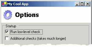
Here's a typical example for visual inheritance: Imagine you want to have a nice looking header on all of your dialog windows, maybe something like this:

With VI, you define a base class for all your dialogs, containing the header (a panel docked to the top, with a picture box for the image and a label for the text). You then define two properties on the form for setting the icon and title text:
public string TitleText
{
    get { return m_lblTitle.Text; }
    set { m_lblTitle.Text=value; }
}
public Image TitleImage
{
    get { return m_picTitle.Image; }
    set { m_picTitle.Image=value; }
}
If you derive a form from this base class, your derived form will automatically feature the header defined in the base class; using the two properties, the header can be customized. Cool, huh?
This is usually the point where articles describing visual inheritance stop, leaving out some of the really important questions:
Question: How do I make sure the controls on the derived form are positioned correctly if the size of the header changes?
Define a panel on the base form below the header and make it accessible from the derived form by setting its access specifier to e.g. "protected". Set "Dock" to "Fill". In your derived form, you drop your controls into this panel. If the size of the header changes, the controls will be repositioned automatically, as they are positioned relative to the upper left corner of the panel they live in.
DON'T position the panel manually and set the anchor to "Top, Bottom, Left, Right". This will not work correctly if the size of the derived form differs from the size of the base form.
Question: But I want to define specific areas for the controls on the derived form - how do I do this without using anchors?
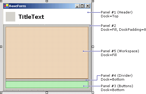
Use nested panels and the "DockPadding" property. The following image shows a base form with two panels to be used in derived forms (panels #3 for buttons like OK and Cancel, and #5 for all other controls):

Of all the panels, only #3 and #5 are set to "protected", the remaining are set to "private".
Question: What is so bad about anchors?
As a rule of thumb, use anchors other than "Top, Left" only on forms/controls that are not used as the base for other forms/controls. This is because the layout of anchored controls will not be updated if the size of the derived form/control is changed in the "InitializeComponent()" method of the derived class. If the form is resized later, things are Ok. This is one of the reasons why this problem sometimes remains unnoticed until some time later, when suddenly VI seems to be broken.
Question: But I can fix it by making the controls "protected"?
Yes and no. First of all, if form A contains a control X that is anchored, and form B is derived from A and has a different size, then setting X to "protected" fixes the problem only for B, but not for a form C derived from B. And under some circumstances there still seem to be some problems left even in B (I didn't invest too much time into researching this, though)
From a OOD point of view, making lots of controls accessible from derived classes only to fix layout problems isn't such a good idea, anyway. If your base form contains e.g. a list, then it's better to offer only the concept of a list through properties, methods and events, but not the actual listbox control. If you decide to switch to a dropdown list or a listview at a later time, you don't have to touch the code in the derived classes.
Question: How do I position OK and Cancel buttons in the lower right corner without a gazillion nested panels?
A lot of layout can be done with surprisingly few panels. Of the panels shown in the image shown above, the divider panel is actually not necessary (I just added it to make things a bit easier to understand in the first step). The secret is the right combination of docking and dock padding. Take a look at this:

The buttons are 23 pixels high, the padding at the top is 8 pixels, so the height of the panel was set to 31 pixels.
Question: But what about more complex layouts?
From my own experience, if you have a base form with a complex layout, something already went wrong in the (non-visual) design of your code. Note the word "base": On a normal form e.g. for data entry, a complex layout is nothing unusual or even bad. But if you have a base form, you want to reuse something on that form - if this "something" is too complex, it should be encapsulated in a user control. User controls are a powerful tool for reducing the complexity of layout and code. Most layouts can be broken down to a few user controls which in turn can be positioned easily using docking and dock padding. And it's not a secret that code definitely benefits from dividing it into smaller units.
If you know that your user control will not be used as the base for another control (you could make it
sealedas a reminder), you can again use anchoring. Here's the funny part: You can use anchoring inside a control that lives on a form that in turn is used as the base for another form. But of course, you cannot use anchoring to position the user control on the base form.Conclusion
- Don't use anchoring on forms or (user) controls you want to use as the base for other forms/controls
- Look at what you can achieve with panels, docking and dock padding
- Reduce complexity by using user controls (you may want to read a bit about user controls here).
Update (28.10.2003)
Since the original post, I have written two follow-ups that may be of interest for developers using VI and/or docking:
- Visual Inheritance Revisited (more detailed information about VI) and
- More Layout with Docking (not VI-related)
-
Find (Wouldn't it be cool, part 3)
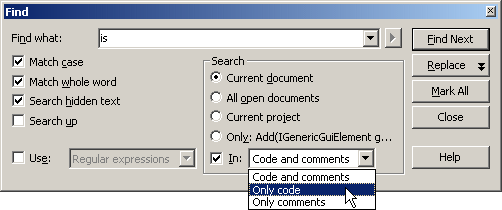
Each time I'm searching my source code for the word "is", I wish VS.Net had something like this:

-
When your WinForms UserControl drives you nuts
WinForms user controls are that kind of technology that seems to be very easy at first, works pretty well for quite a while and then BAM! explodes in your face. I spent some hours today solving problems with a control that was working fine in the running application, but just didn't like the IDE's designer anymore, throwing exceptions all over the place. Here are some tips based on what I learned today searching Google's Usenet archive:
1. Don't take things for granted
Just because you can create a simple user control (e.g. combining a text field and a buttons) without reading any documentation, doesn't mean that knowledge about what is actually happening in design mode isn't necessary. Always keep in mind that there's some code running even though your program is not started. When a form or a control is displayed in the IDE in designer view, its (default) constructor is called which in turn calls InitializeComponent(). And this is where the trouble usually starts when this form/control contains a badly written user control.2. Take care of your control's public properties
If you don't add any attributes to a read/write property (huh, what attributes?), two things happen:- The property is shown in the "properties" window in the IDE.
- The initial value of the property is explicitly set in the
InitializeComponent()method.
Hiding properties that don't make sense to be edited at design time is a good idea even if you don't intend to write a commercial-quality, bullet-proof control ready to be shipped to thousands of developers. It's simply a matter of good style and it's done with very little effort using the
Browsableattribute:[ Browsable(false) ]
public string MyProperty
{
...
}The second point can be quite a shocker in some cases, because it means that
- the property is read when the control is placed on a form (quick experiment: throw an exception in the "getter" and see what happens in the designer).
- the property is set at the time the control is created, not when it is actually added to the form.
As long as your control only gets or sets the value of a private member variable, things are fine. But if e.g. reading the property triggers some actions that require the control to be completely initialized, you can get into trouble (remember the "Add any initialization after the InitializeComponent call" comment in the constructor?). And setting the property "too early" can be a problem e.g. if your property's setter contains code that performs some kind of automatic update.
This behavior of the designer can be avoided by using the
DefaultValueattribute:private string m_strMyText="";
...
[ DefaultValue("") ]
public string MyText
{
...
}The
MyTextproperty will not be set to "" in theInitializeComponent()method (which would be the case without the attribute).While you're at it, consider adding the
DescriptionandCategoryattributes as well. Adds a nice touch.3. Don't rely on
this.DesignModetoo much
The inheritedDesignModeproperty of your user control is an easy way to find out whether the control's code is running in the designer. Two problems:- You can't use it in the control's constructor. At that point, the control's "Site" (which provides the actual value of
DesignMode) hasn't been set, thusDesignModeis always false in the constructor. - "Running in the designer" is a matter of point of view:
- When editing a control
MyControlin the designer,MyControlis obviously in "design mode". - When using
MyControlon a form being edited in the designer,MyControlis still in "design mode". - But if
MyControlis placed onMyOtherControl, andMyOtherControlis placed on a form,MyControlis no longer in design mode (butMyOtherControlstill is)
- When editing a control
4. If you just don't know what to do: debug!
Open the project's properties dialog, set the debug mode to "program", apply, set "start application" to your VS.Net IDE ("devenv.exe" in the "Common7\IDE" directory). Set some breakpoints in your code (e.g. in property getters/setters) and start debugging. A new IDE will open (empty), you load the project and then open the control in designer view. Cool stuff.